The widgets are a suite of configurable interactive user interface controls that can be embedded directly within browser based applications to provide access to HeritageData vocabularies. The widgets use the HeritageData web services as their data source, and utilize the local browser cache to avoid repeated service calls to the same resource. The widgets can be utilized through the addition of a small script (usw.seneschal.YYYYMMDD.js) and an associated style sheet (usw.seneschal.YYYYMMDD.css), as shown in the various demonstration pages. In each case you can right click and view source to see exactly how the widgets are being configured and used in the demonstration page.
Note – the downloadable script is a combined ‘minified’ version of a full suite of widget scripts; all scripts are available as Open Source under a Creative Commons Attribution (CC-BY) license.
Widget controls
Scheme list
Displays a selectable drop-down list of all concept schemes currently available in the data store. The list is subdivided according to the originating attributed organisation. Hovering the cursor over any of the schemes in the list pops up a small description of the scheme. Selecting any scheme in the list triggers a notification event that can be handled programmatically so that the selected value can be used in some way within the web page.
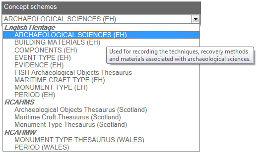
Default styling for the control is obtained from the associated style sheet as class name usw-seneschal-schemelist. A demonstration page shows how to configure and use the scheme list control.
Scheme details
Displays name and description of a specified scheme. Can be used in conjunction with the scheme list control

Default styling for the control is obtained from the associated style sheet as class name usw-seneschal-schemedetails. A demonstration page shows how to configure and use the scheme details control.
Top concepts
Displays a list of top (hierarchical root) concepts for a selected scheme. Hovering over any of the concepts displays the identifier of the concept in the footer area. Selecting any concept in the list triggers a notification event that can be handled programmatically so that the selected value can be used in some way within the web page.
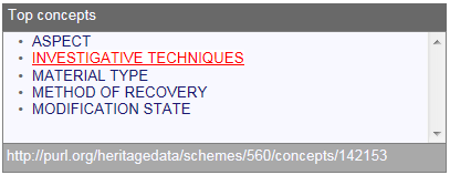
Default styling for the control is obtained from the associated style sheet as class name usw-seneschal-topconcepts. A demonstration page shows how to configure and use the top concepts control.
Scheme details (composite)
Combines the scheme details and top concepts controls into a single unit.
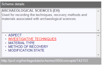
Default styling for the control is obtained from the associated style sheet as class name usw-seneschal-schemedetailscomposite. A demonstration page shows how to configure and use the scheme details (composite) control.
Concept details
Displays labels and scope notes for a selected concept. Can be used in conjunction with any other control that allows selection of concepts.
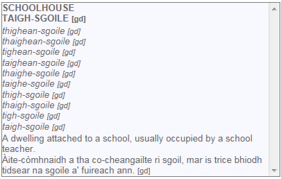
Default styling for the control is obtained from the associated style sheet as class name usw-seneschal-conceptdetails. A demonstration page shows how to configure and use the concept details control.
Concept relations
Displays a list of concepts related to the selected concept via broader (‘BT’), narrower (‘NT’) or related (‘RT’) links. Selecting any of the displayed links allows interactive navigation of the concept space and also triggers a notification event that can be handled programmatically so that the selected value can be used in some way within the web page.

Default styling for the control is obtained from the associated style sheet as class name usw-seneschal-conceptrelations. A demonstration page shows how to configure and use the concept relations control.
Concept details (composite)
Combines the concept details and concept relations controls into a single unit.

Default styling for the control is obtained from the associated style sheet as class name usw-seneschal-conceptdetailscomposite. A demonstration page shows how to configure and use the concept details (composite) control.
Term search
Control for searching on terms (preferred or alternate labels) within a specified scheme. The user may choose whether the term to find starts with or contains the specified text. Returned results are highlighted to show where the match occurred. Results are clickable links, selecting any concept in the list triggers a notification event that can be handled programmatically so that the selected value can be used in some way within the web page. The footer displays the number of results returned, hovering over any result displays the identifier for that concept.
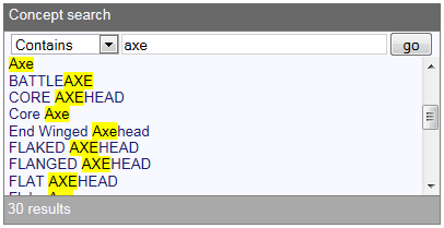
Default styling for the control is obtained from the associated style sheet as class name usw-seneschal-termsearch. A demonstration page shows how to configure and use the term search control.
Term suggest
A drop down list of suggestions as the user types.

Default styling for the control is obtained from the associated style sheet as class name usw-seneschal-termsuggest. A demonstration page shows how to configure and use the term search control.
Widget interaction
The individual widgets can be assembled to form larger controls. A demonstration page shows how to configure and make the the widgets interact with each other.
Pingback: Vocabularies in a useful form | Heritage Data
Pingback: GSTAR web services; now with added GeoJSON | GSTAR